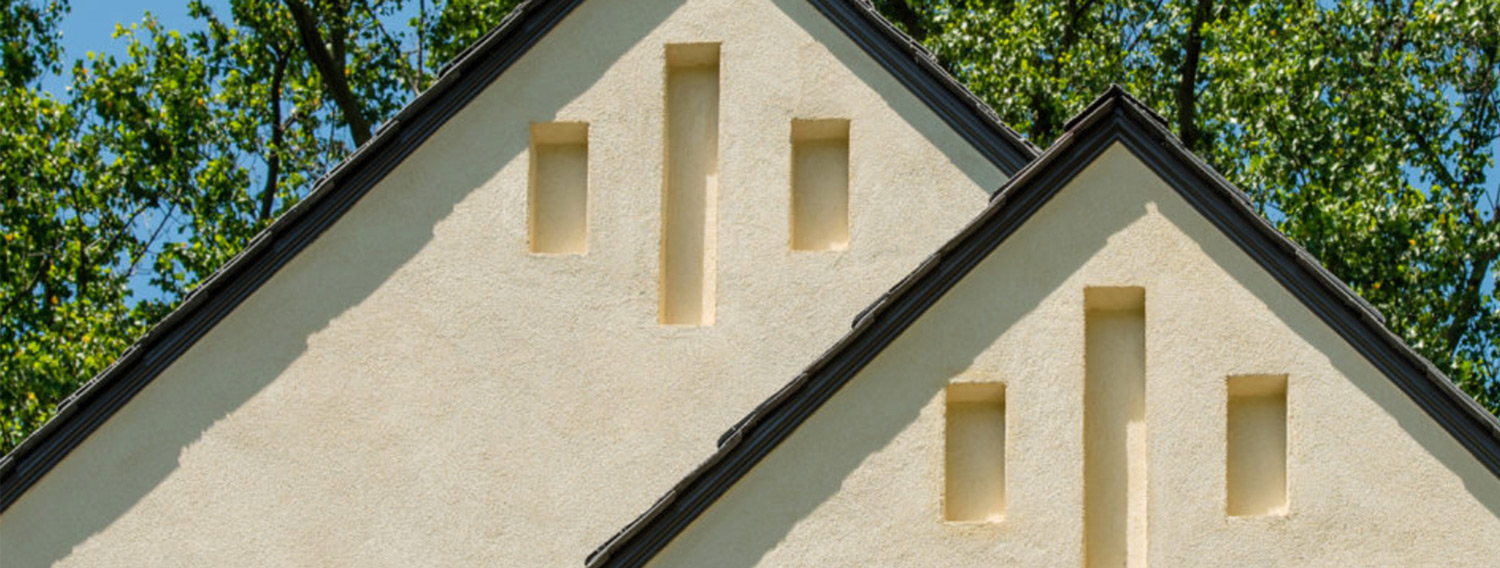
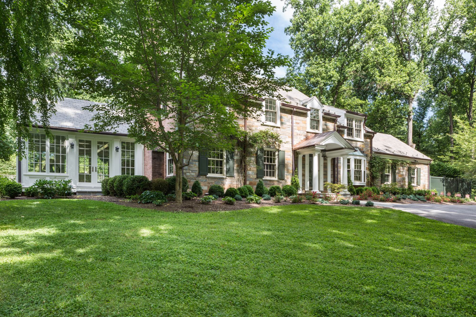
Its interior didn’t match the exterior. A stately Colonial in a tree-filled natural setting, this home had too many crowded and stuffy spaces on the inside. The family wanted a design that held up under their busy lives as well as a welcoming but impressive setting for entertaining.
The ANTHONY WILDER team realized the key to making this home extraordinary would be to strip the design back to the good bones and open up spaces for a natural flow. Incorporating subtle luxury touches such as high-gloss finishes, elegant archways, and striking marble would elevate the mood without looking overdone.
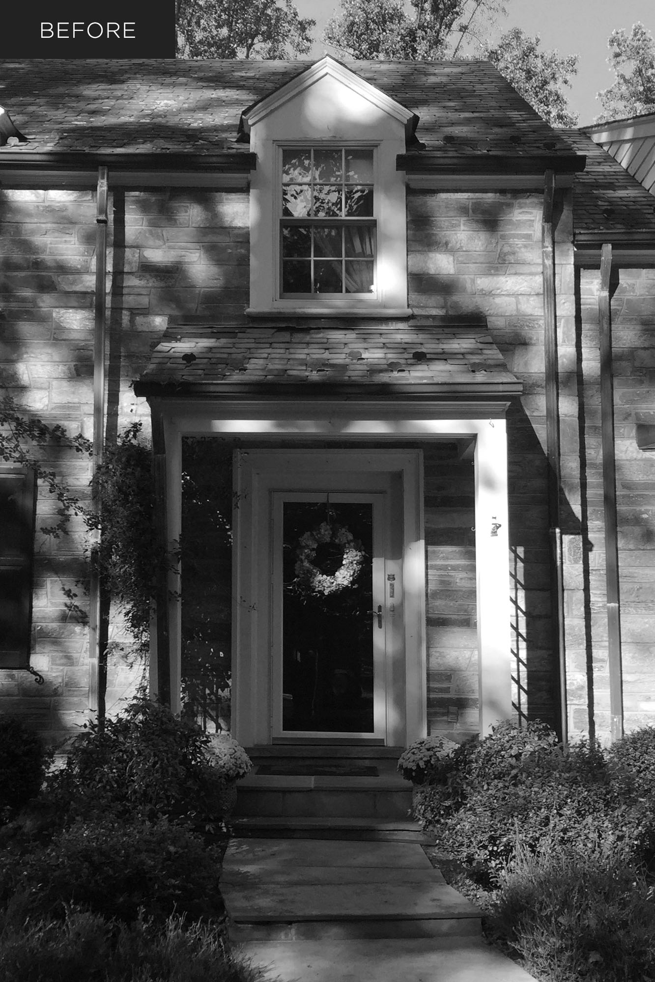
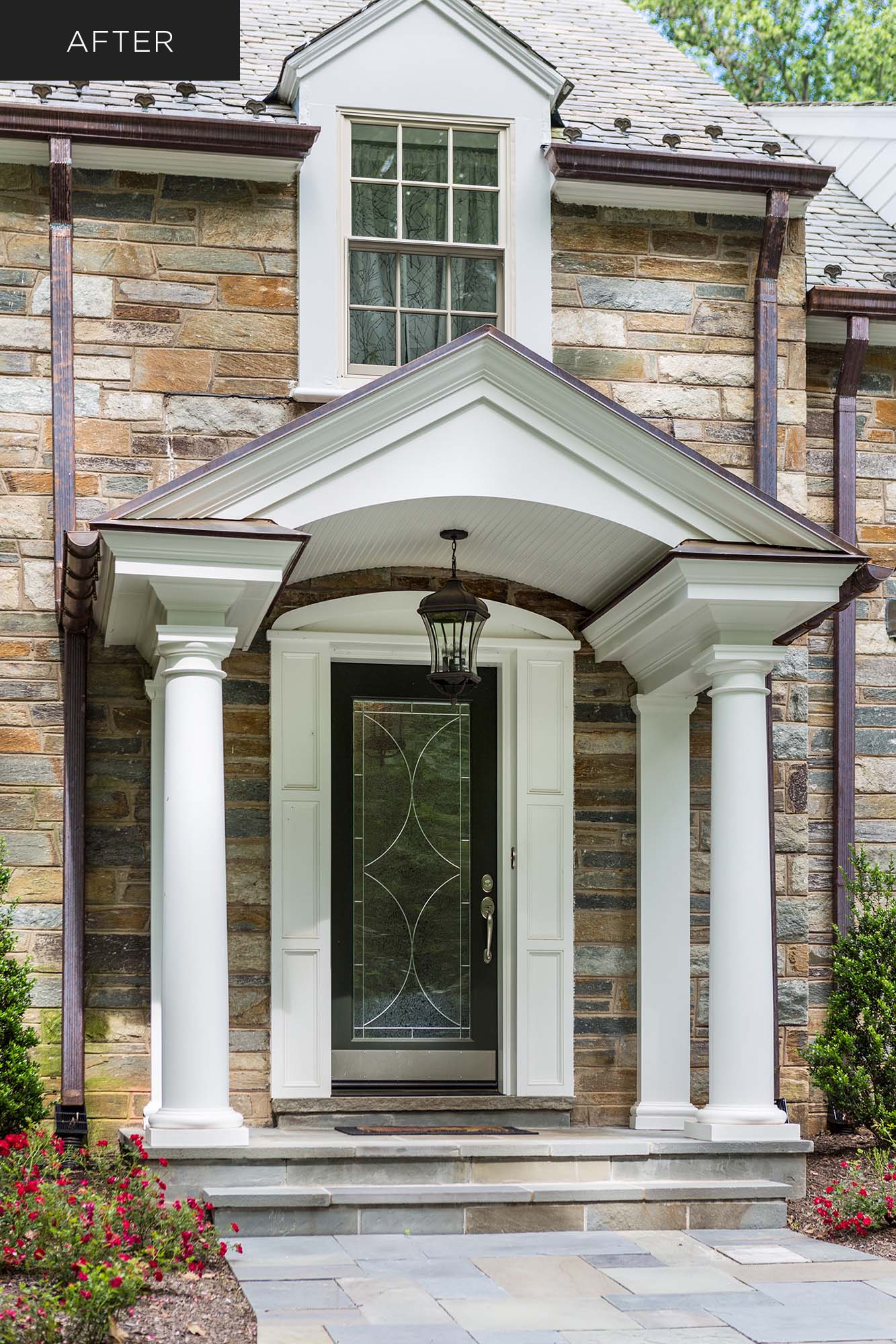
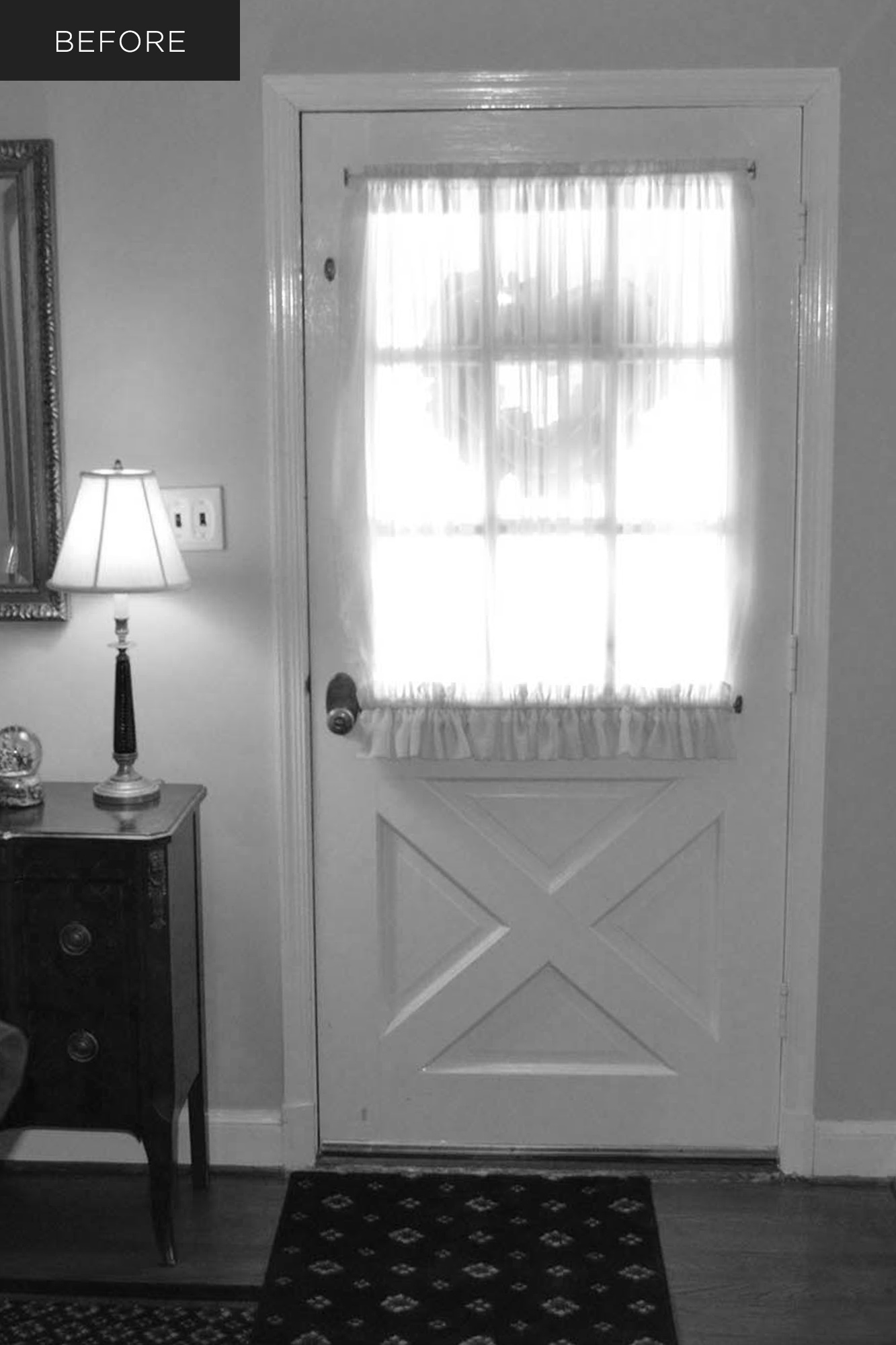
Practically speaking, improvements to access, greater energy efficiency, and sensible storage space convey an assured serenity to daily life.
An expansive natural setting, a rock face exterior, and an appealing light-box of a sunroom gave this home a regal quality. But inside was a confined and sometimes dim network of small rooms, with no coherent flow. Some appliances weren’t working—and the HVAC was working overtime. The layout and functionality needed modernization, and the interior design needed elevation.
Before and after
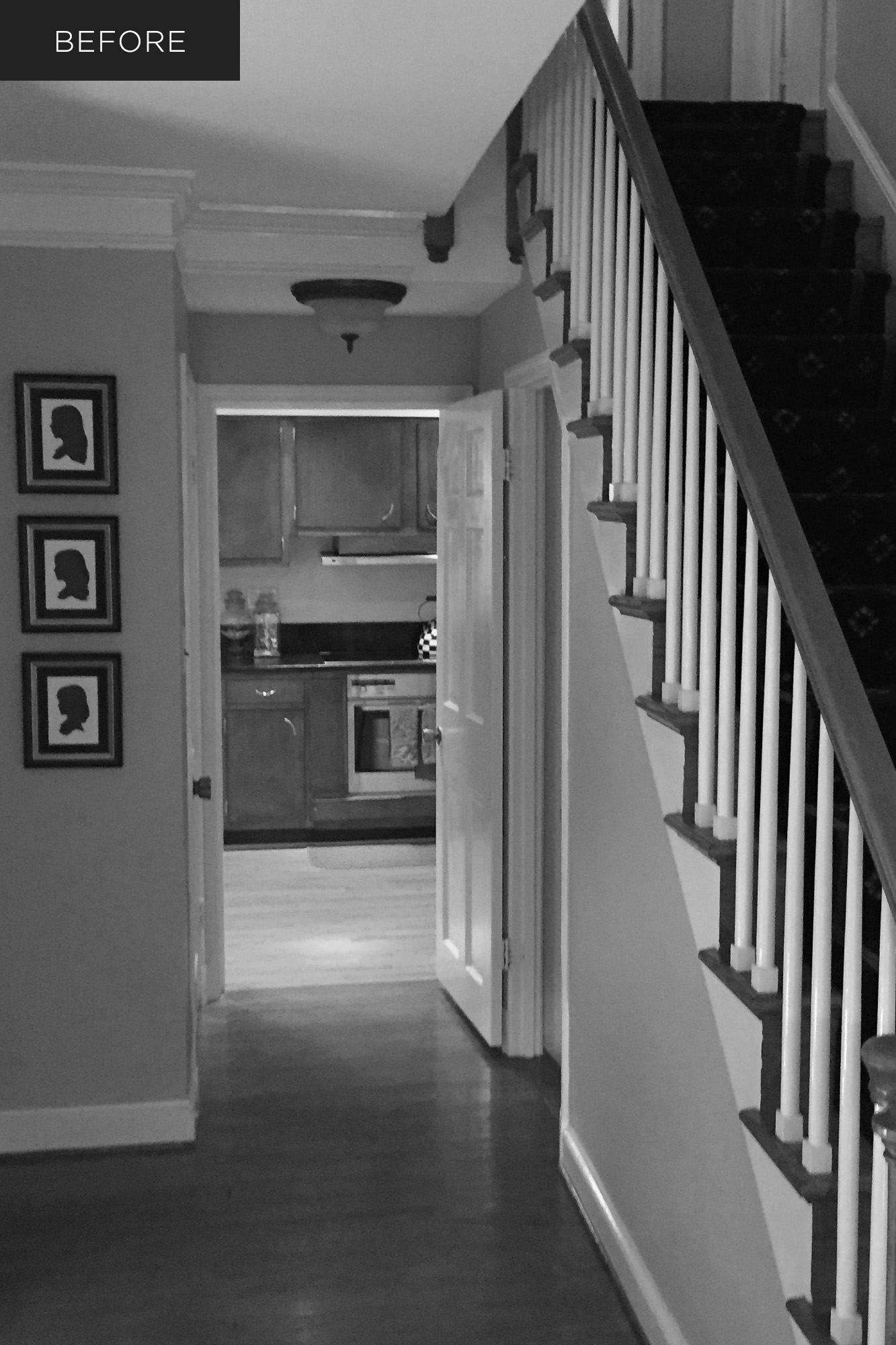
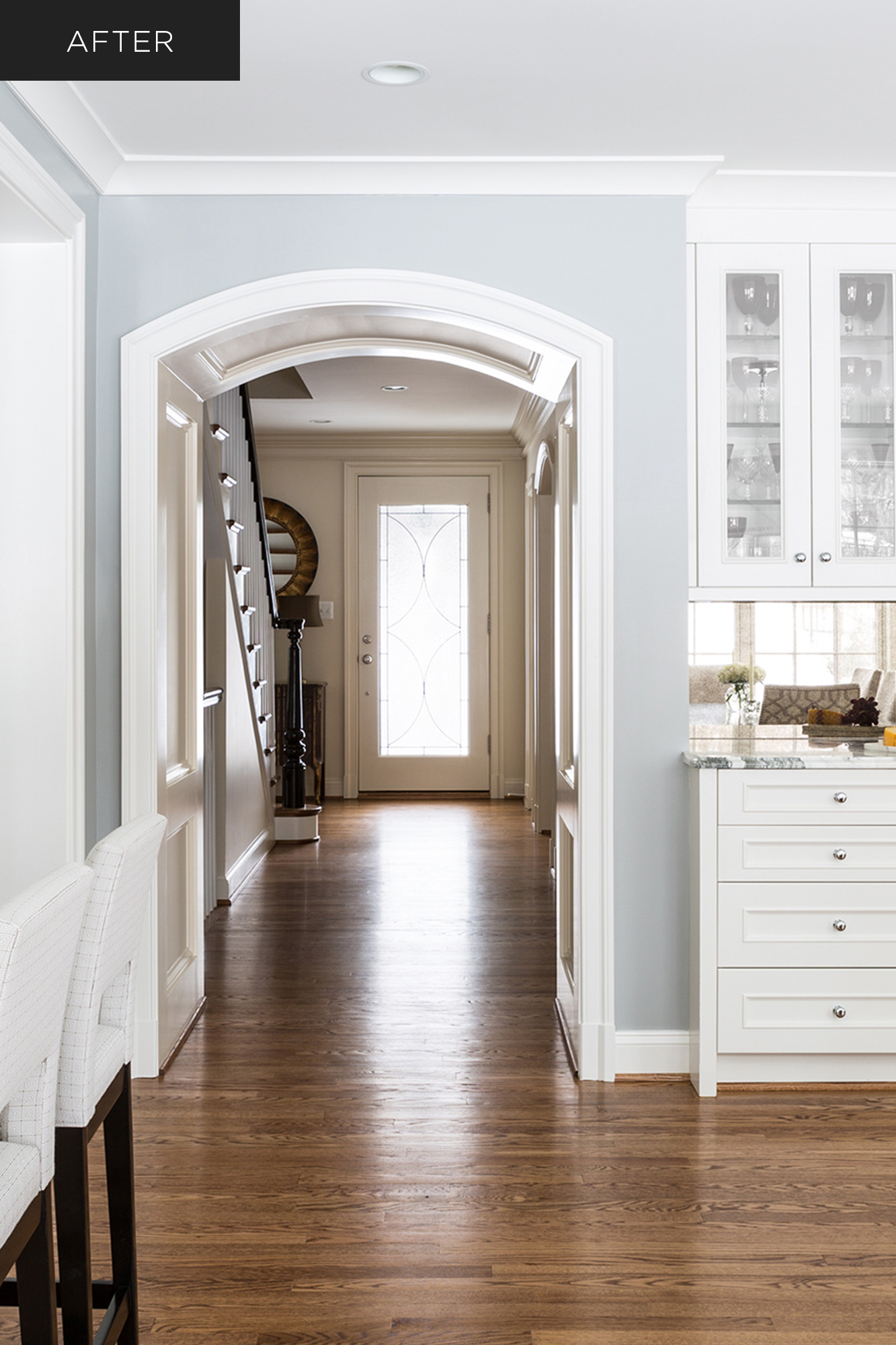
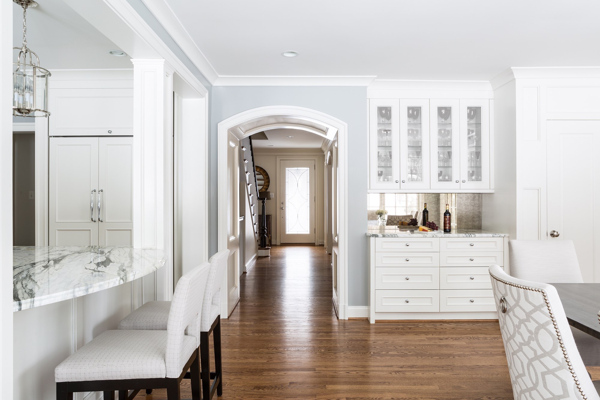
The home needed space, storage, and flow. The family wanted a place that was fun and functional for daily life for the long-term as well as for entertaining, from casual gatherings to formally elegant occasions.
The renovation resulted in an expanded kitchen with breakfast area and added a home office. Three baths were renovated—the master bath, an upstairs bath, and a powder room. The sunroom got new, custom crafted windows and a coffered ceiling.
Most of the improvements were made by reconfiguring the existing design and crafting details. Only the kitchen, with a limited set-back, was an expansion of the footprint.
The result feels spacious and open, as if it were a much bigger house—but it’s not. It’s a better-designed house.
More space for relaxing
The family needed fewer mid-size spaces for relaxing and more precise assignment of spaces to get things done. Flow is logical, and connections are clear but not obtrusive—and everywhere are links, views, and presence of natural light and the outdoors.
Aesthetic enhancements
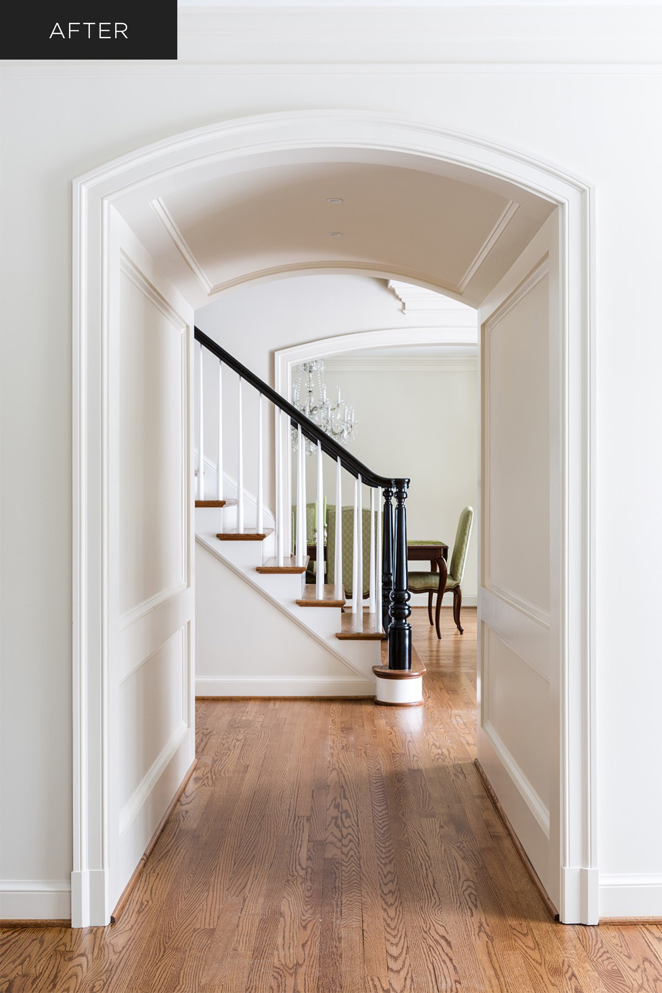
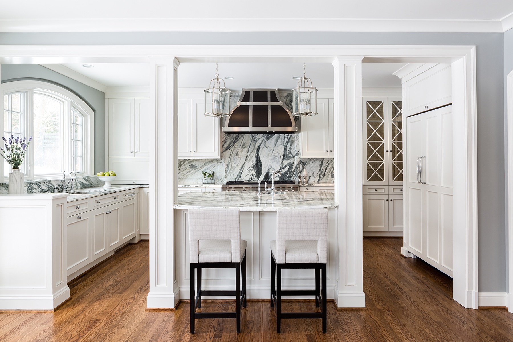
The beauty at the heart of any center-hall Colonial is its symmetry. Too many small rooms and lack of coherent flow clouded this quality. The renovation restored the balance setting up pairs of design elements and directing focus to the center. For instance, there are twin pillars flanking the entrance, at the stairs, and even in the kitchen.
The traditional interior design relies on a neutral color palette with pops of color for interest. To enhance the sense of broad, flowing space, the main floor has the same wood flooring throughout.
Interior design details
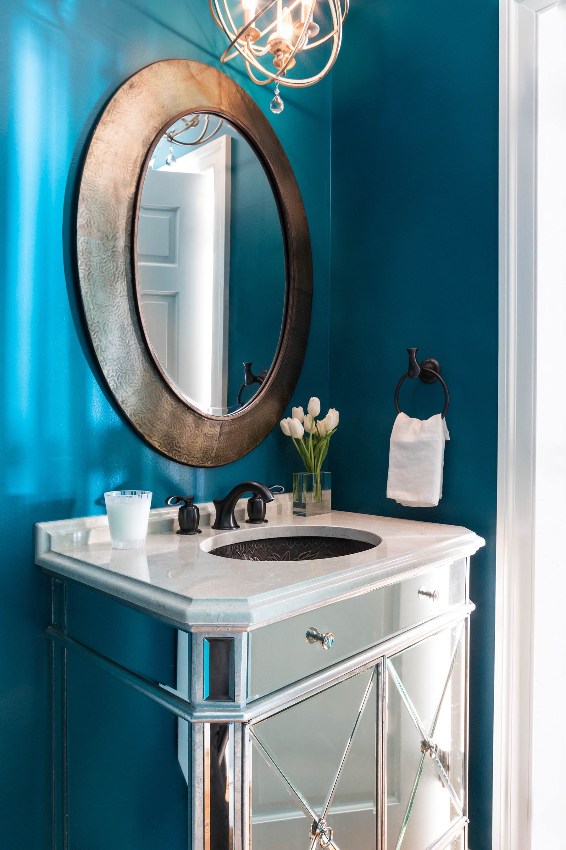
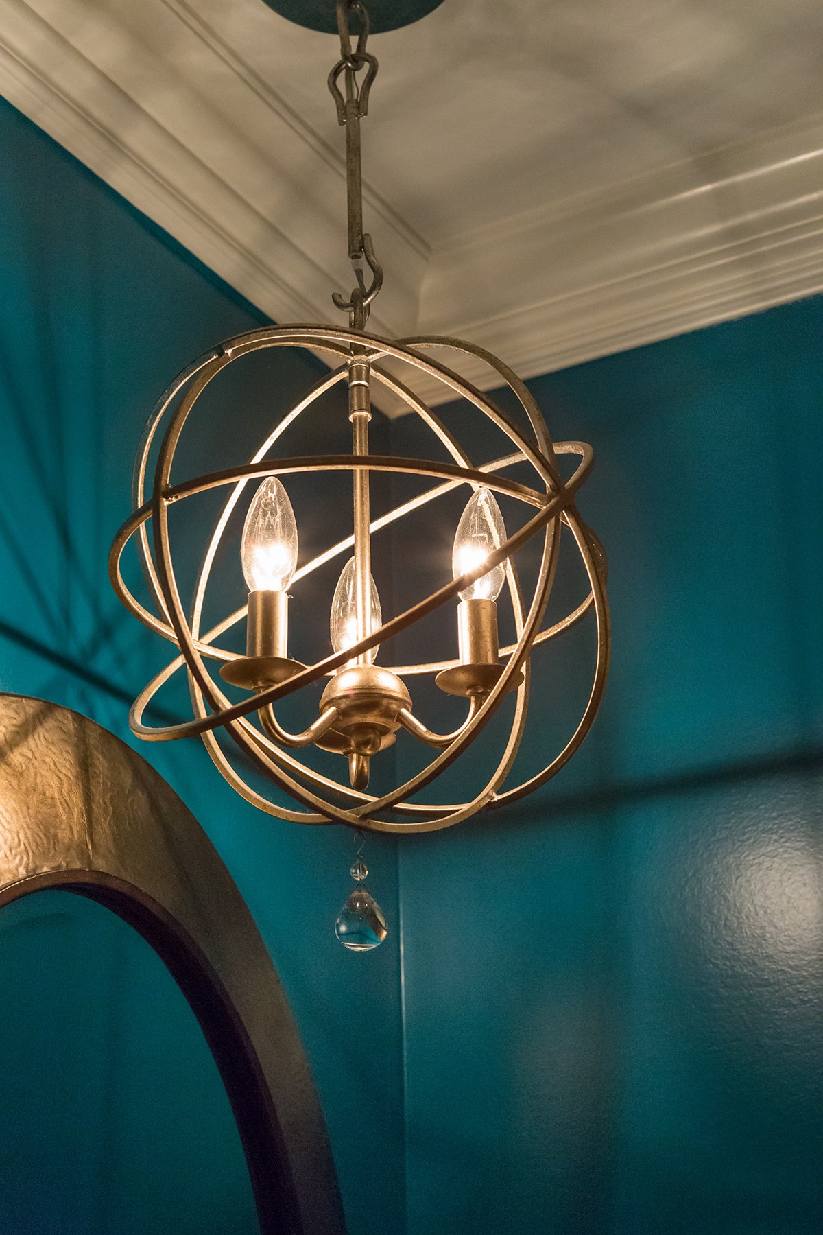
A journey through the home presents a gallery of examples of fine craftsmanship that hold enduring interest but don’t insist on attention, including precisely cut, high-contrast black and white marble, and curved soffit molding archways between rooms.
Kitchen changes
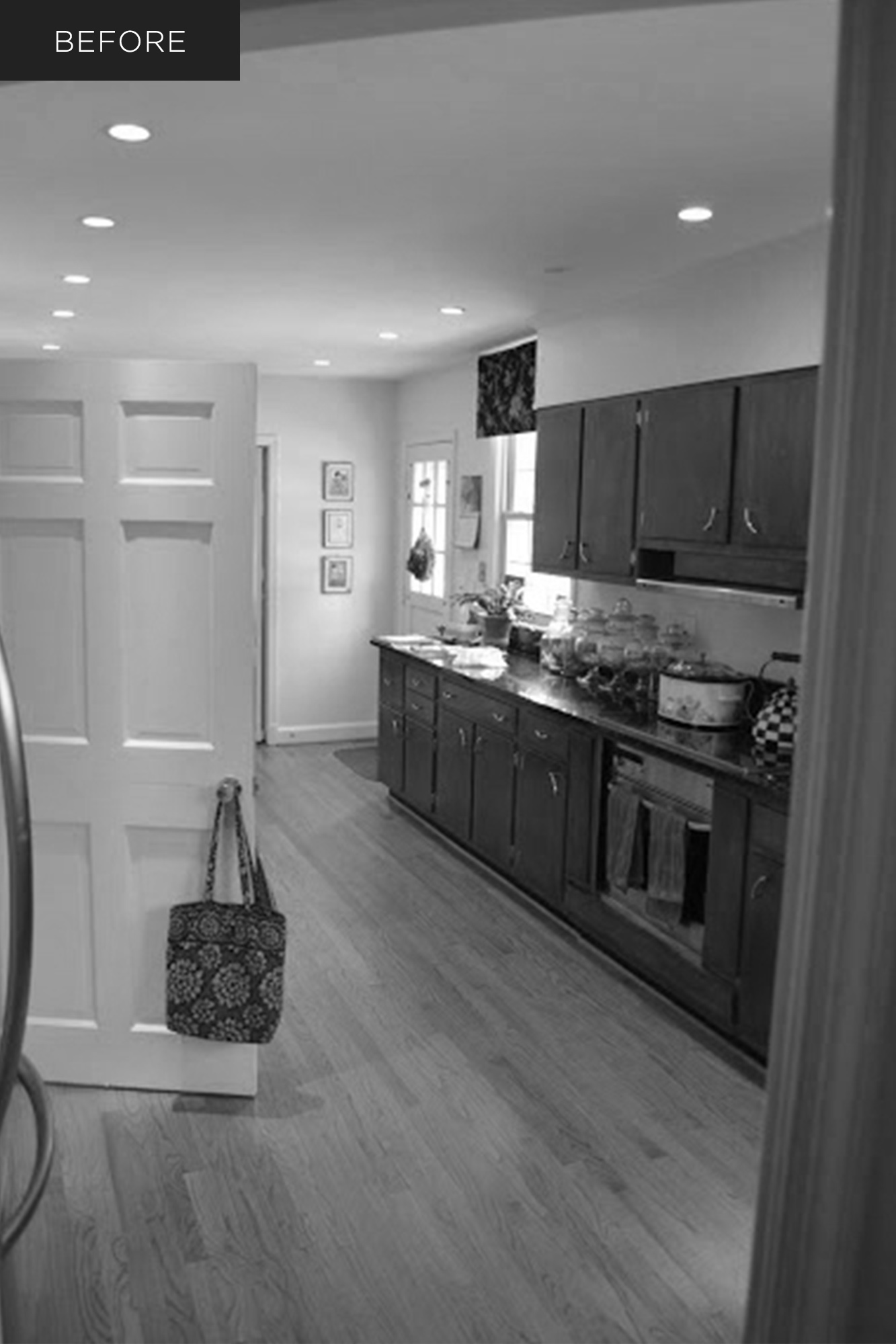
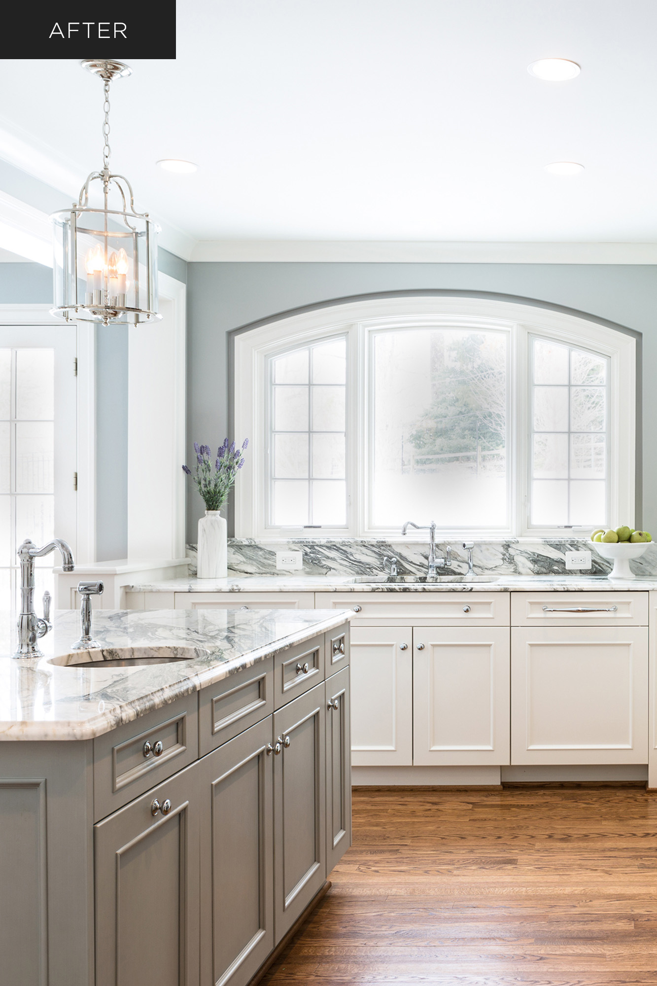
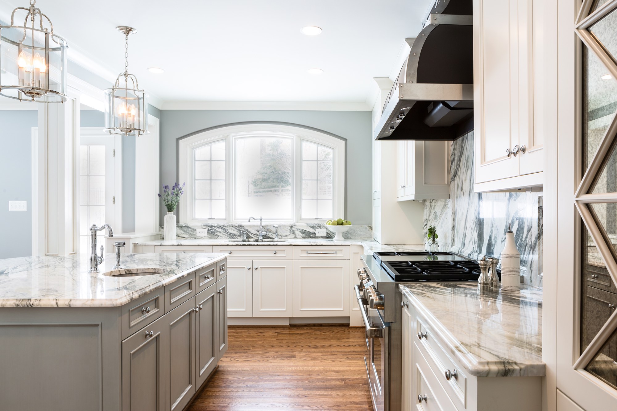
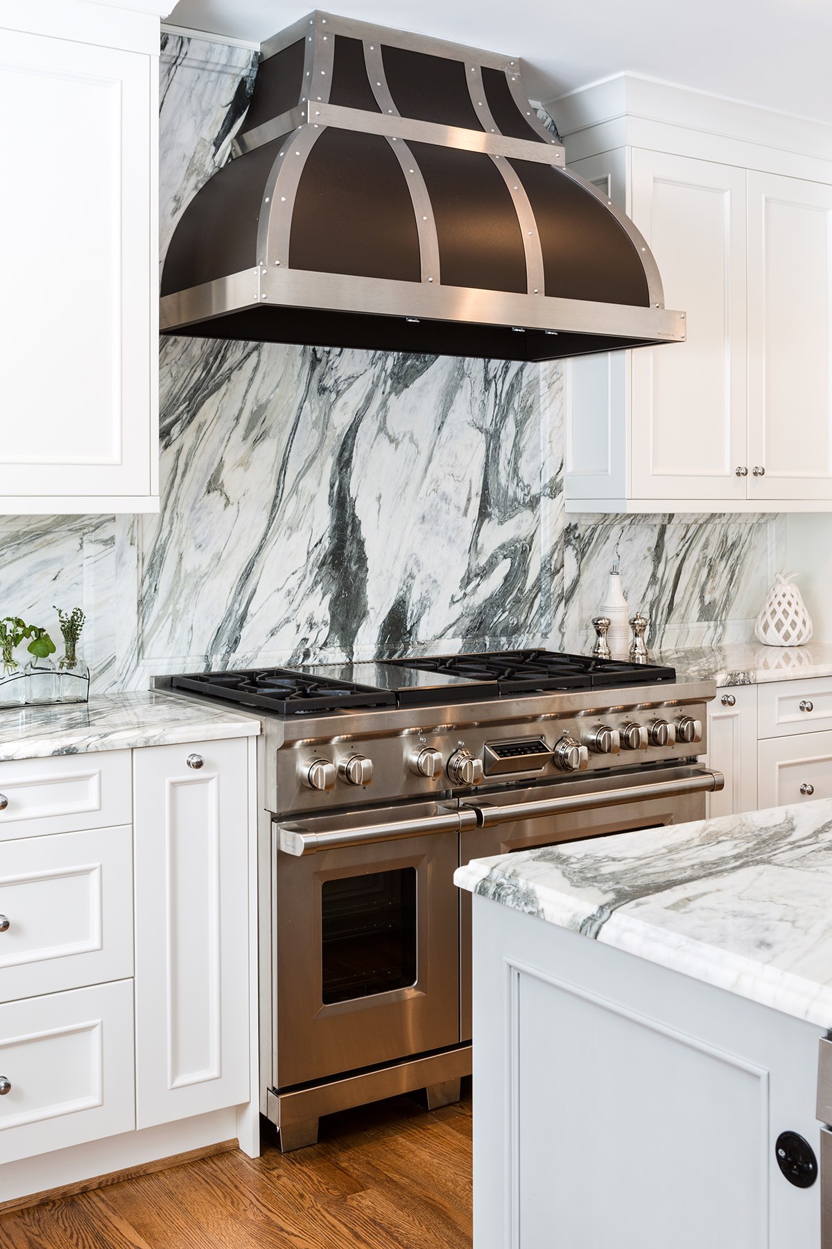
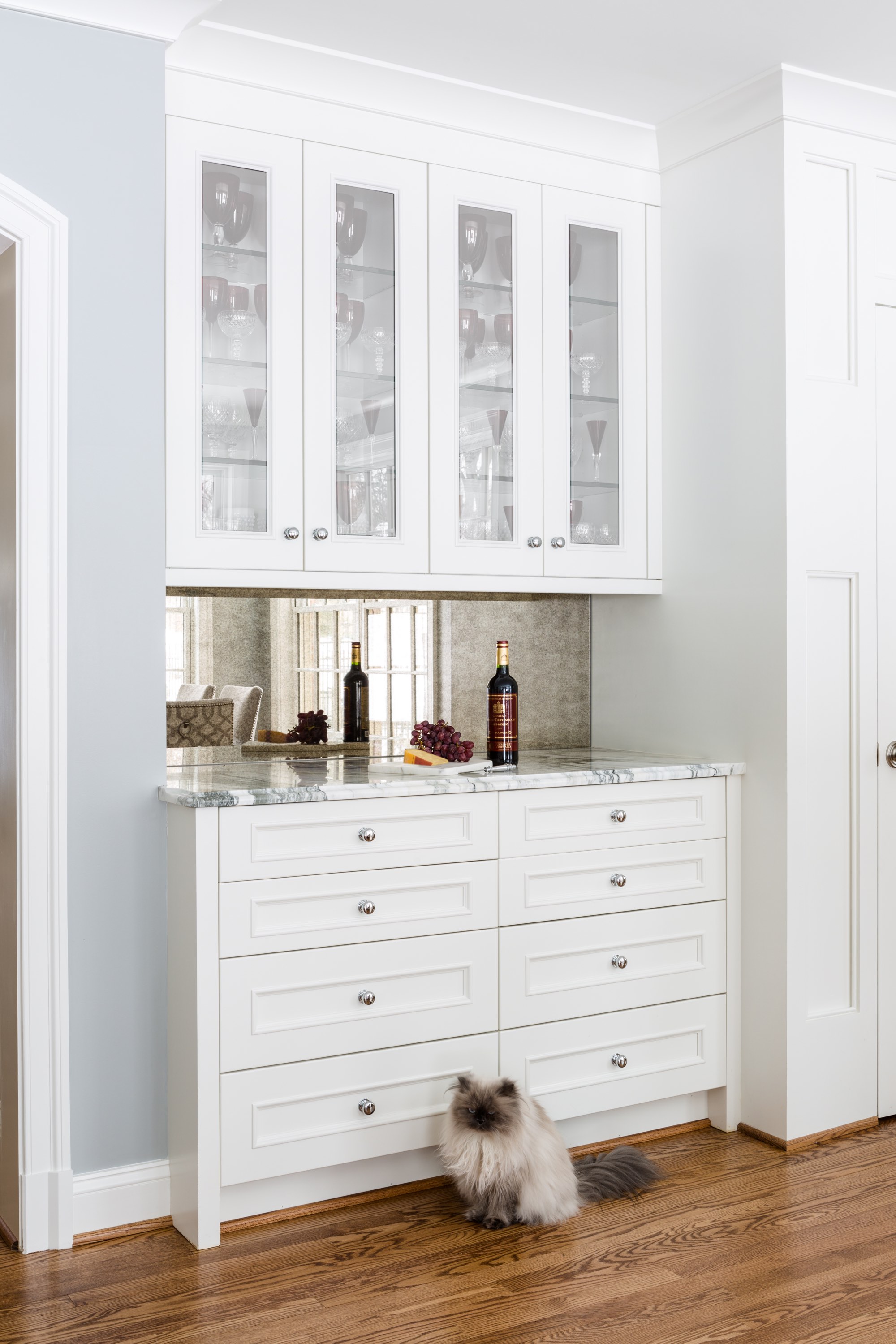
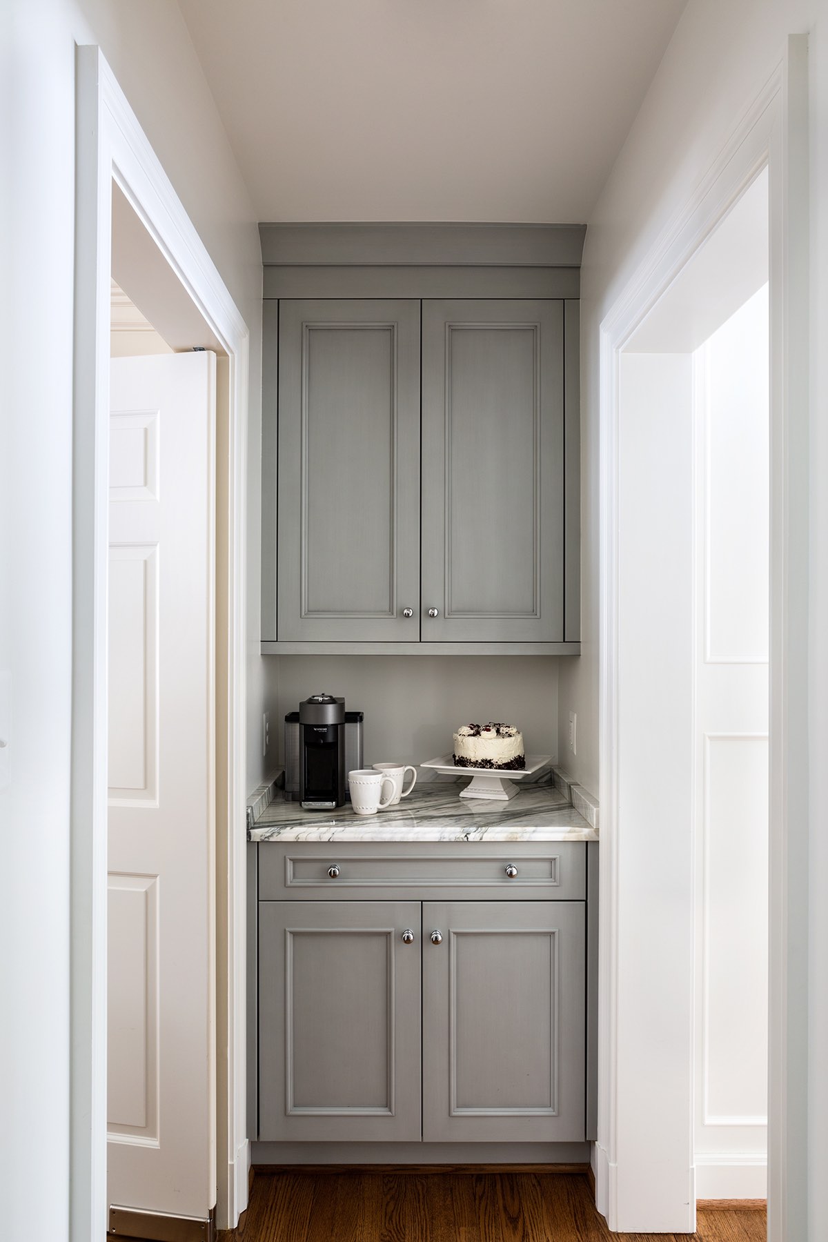
The kitchen had a dim, tunnel-like layout and several barely functioning appliances, making it exhausting and inefficient to work in. The renovation features a backsplash with a striking swirl of black-and-white marble evocative of a drift of smoke.
Dramatic black-and-white marble, a recurring motif, required careful cutting and selection to “let the stone speak.” It brings contrast and movement to the otherwise balanced design—and it speaks of luxury as well.
Storage was an enormous challenge for this busy household. Carving a pantry and mudroom out of unused space eliminated both real and visual clutter.
Sunroom that shines
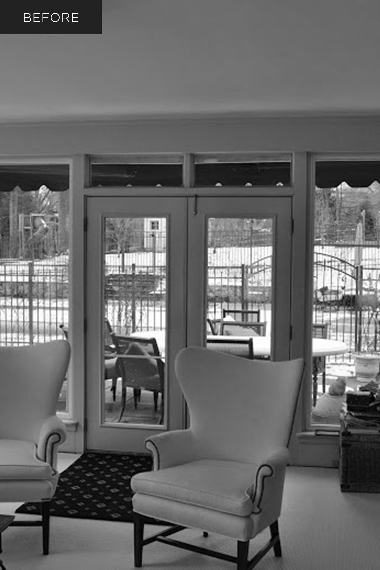
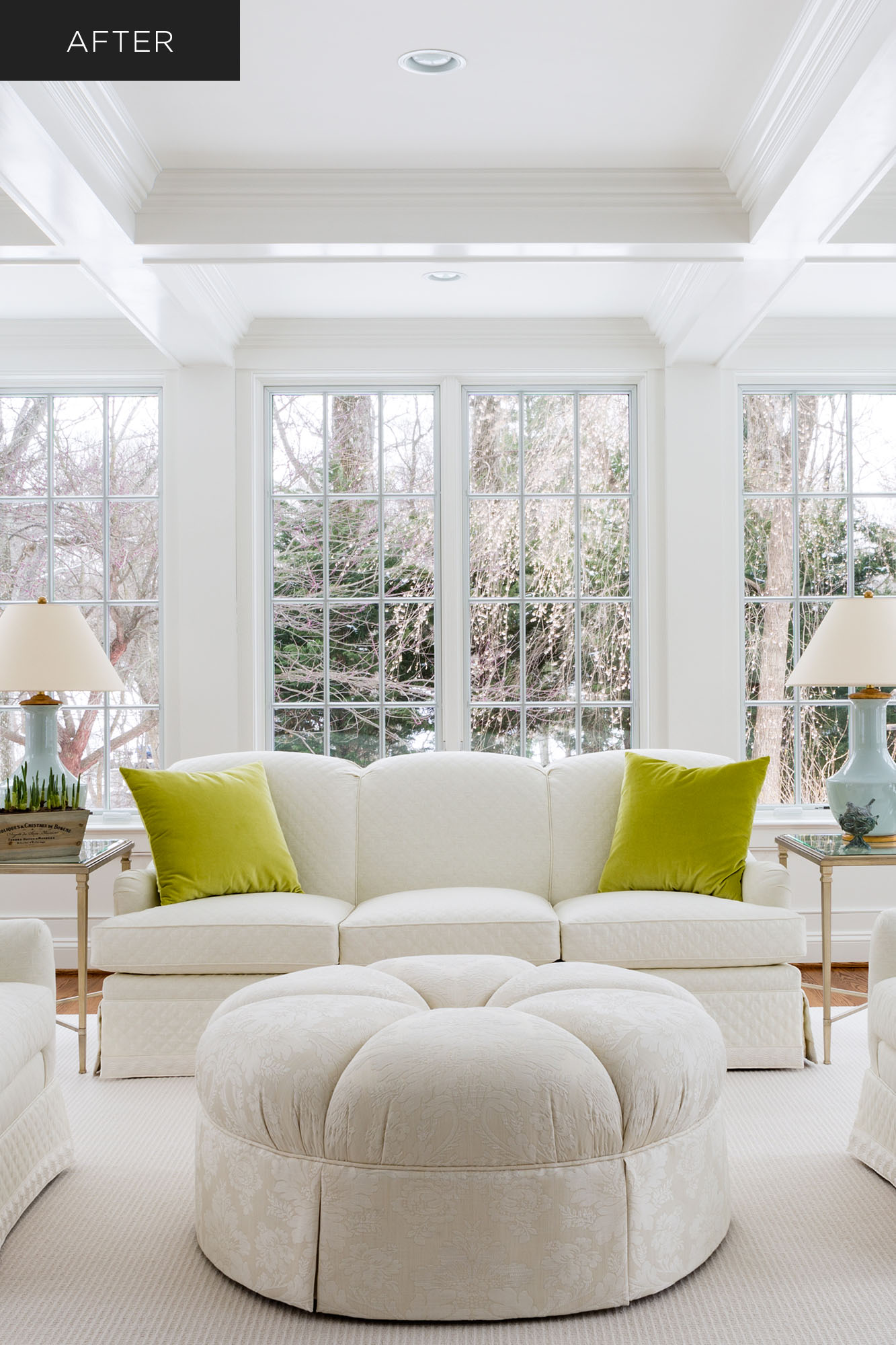
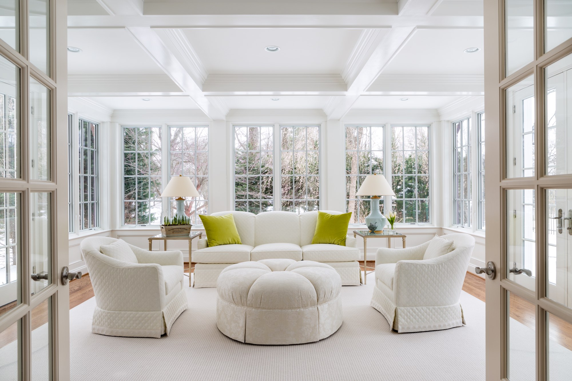
The sunroom was a constant temperature challenge. Structural repairs and energy efficient windows solved that. White paint, a loftier coffered ceiling with trim echoing the rest of the home, and newly framed windows direct light and make the space feel more open and airy.
Coming home
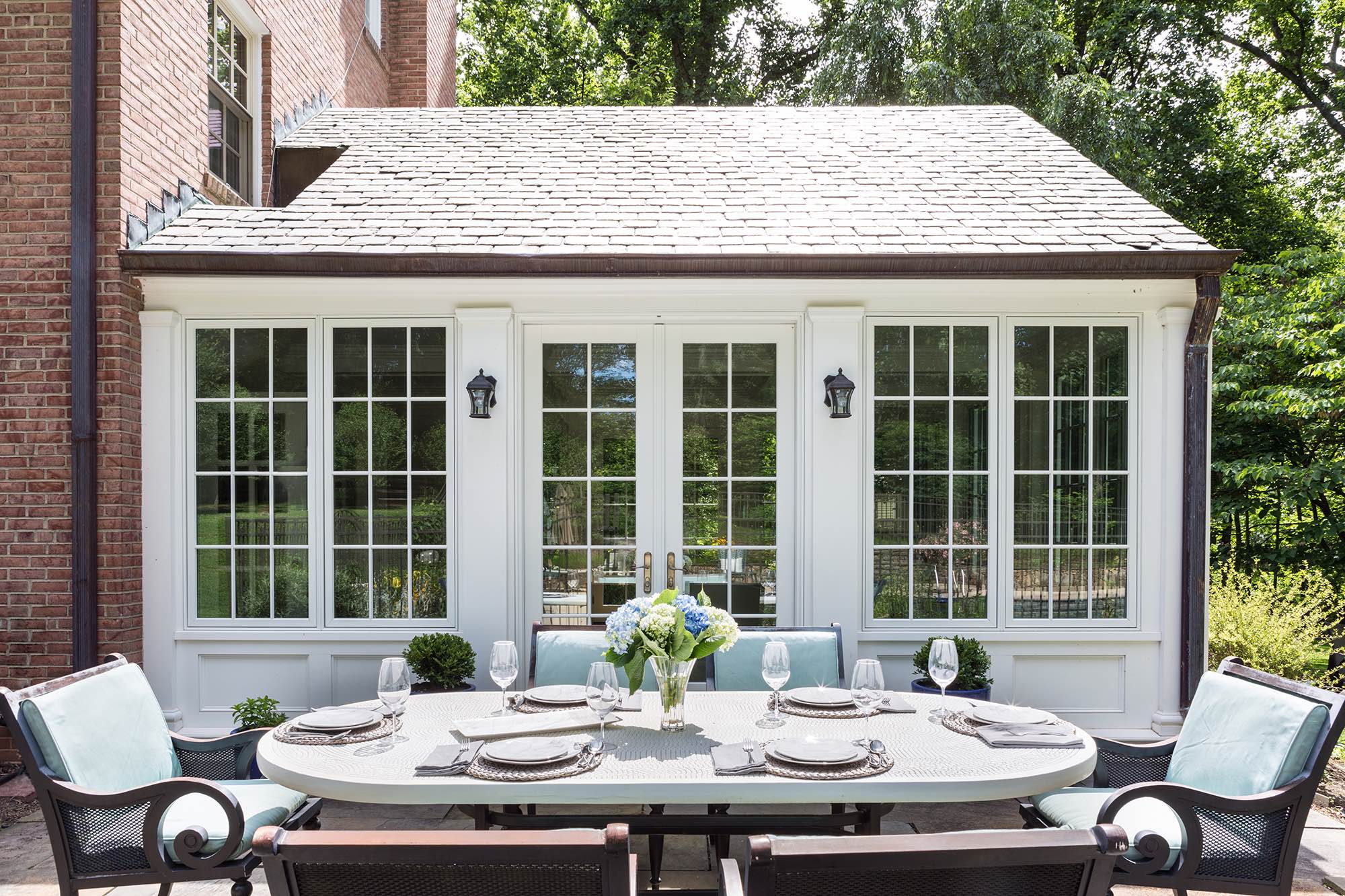
From the first look to the back patio, visitors are struck with a sense of balance and spaciousness—and a clear view of the wooded landscape of the backyard.
The family’s enjoyment of their new home is palpable—they continue to work with ANTHONY WILDER’s interior design team.
Read more about this home in Southern Home Magazine.

