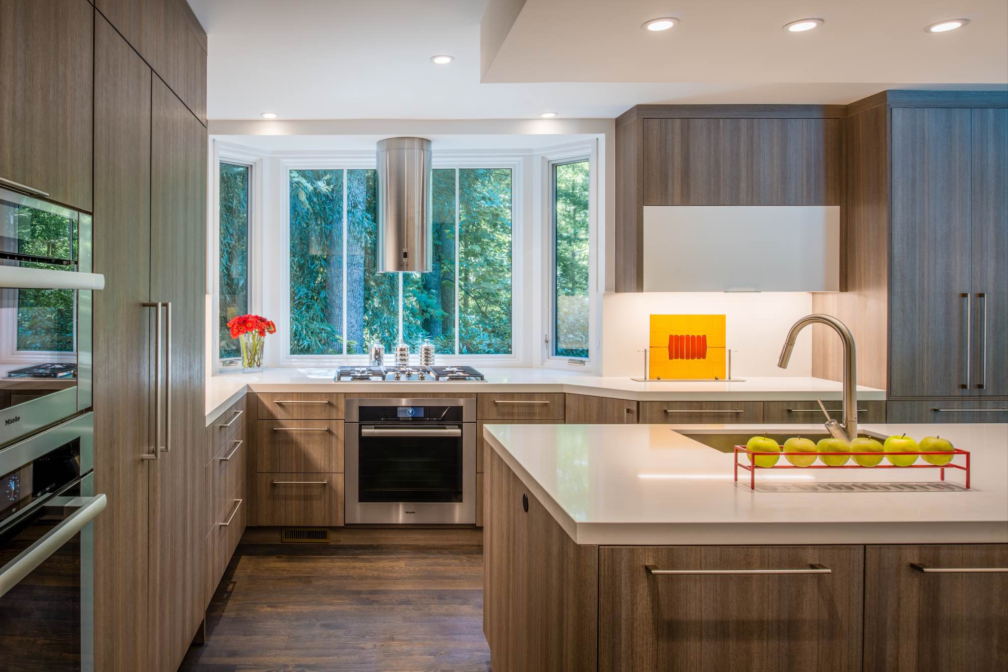
The fridge was in the hallway. The dining room, open to bright morning light, often went unused. The dark, small, galley kitchen got heavy use, with three teenage children and two working parents who love cooking.
When it was time to renovate their kitchen, this design-centric couple had the advantage of design knowledge and expertise. In their work at ANTHONY WILDER, JP Ward, AIA, a licensed architect, and Kelly Ward, NCIDQ, an interior designer, had helped many families design and build their perfect custom kitchen. The basic principles they bring to kitchen projects every day helped shape their own approach.
Know your priorities
As do many of the people they design for, the Wards faced the typical challenges of a home built in the 1970s that had not been updated. Such homes are often carved into several small rooms, rather than the open floor plans popular today.
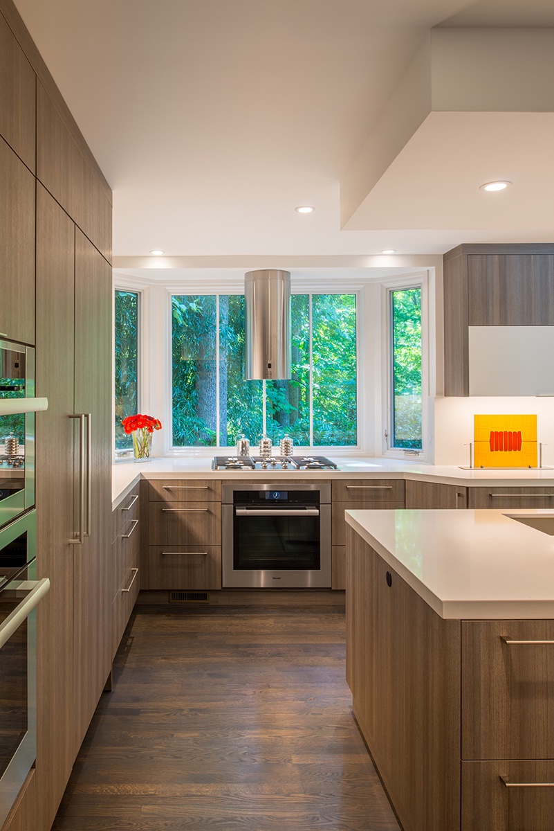
Making the kitchen bigger is usually the first priority for homeowners. Yet it’s just as important to make the space feel less crowded and stuffy. The latter is a matter of design. The Wards used unbroken lines of cabinetry and streamlined surfaces, as well as improving the traffic flow, to make the space feel bigger without significantly increasing its footprint.
Plan for unforeseen conditions
Existing ventilation, electrical, plumbing, and structure can all restrict what’s possible in a kitchen renovation. But some of these factors can be worked around or even significantly improved in a renovation. The Wards, for instance, demolished a wall to open up the kitchen, bring in more natural light and produce a sense of airiness. As you start to make a plan, consult your designers to get a good reading on what shouldn’t change, what can, and what isn’t worth the trouble.
Envision what will bring you happiness
When Kelly Ward looks around her new kitchen, she feels a comfortable, light sense that everything is neat and organized—even when they haven’t had time to put everything in perfect order. A good design can do that. How do you envision yourself and your family using your kitchen area? What do you see yourself doing—helping with homework, sprinkling flour for baking, cooking pasta while having a glass of wine with guests? Most important: How do you feel? Work backward from this vision to discover what you want most from your kitchen renovation. It may not be what the magazines and home shows would show you.
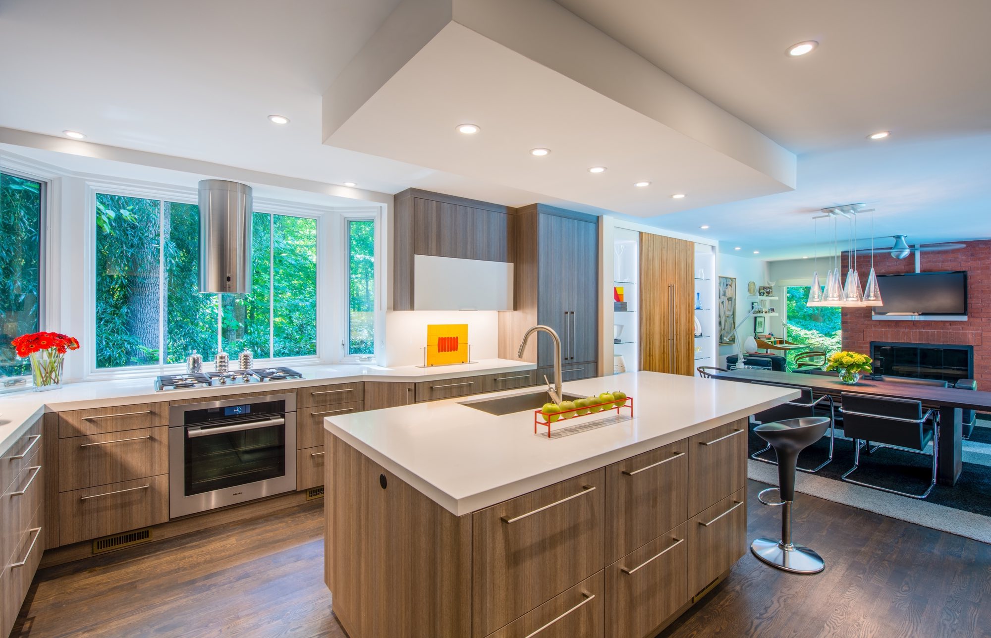
For the Wards, the vision was one of ease, sleekness, and artistic personal touches. The confined spaces and dearth of storage had been causing chaos on a daily basis. The new design and artistic spin on the details reflect and reveal who they really are—that’s the power of design.
Balance trends with your personal tastes
The all-white kitchen trend held strong for more than a decade, and with good reason: It’s light, bright, and feels clean and cheery. But if you find you’re drawn to other colors and materials, listen in. In their design work, the Wards knew they enjoyed working with wood grain. So they chose woods that brought both warmth and a streamlined feel—the grain stretches on strong vertical ribbons to make the space feel larger and the ceilings feel higher. Stainless steel is used as an accent, not the emphasis. White worked well for the quartzite countertops and painted accent panels.
Maximize the views
Adding windows and increasing views is usually worth the effort. Explore ways to get more natural light into your kitchen space. Check the angles at different times of day to see how the light will affect the space at breakfast or dinnertime.
Bring in some adventure
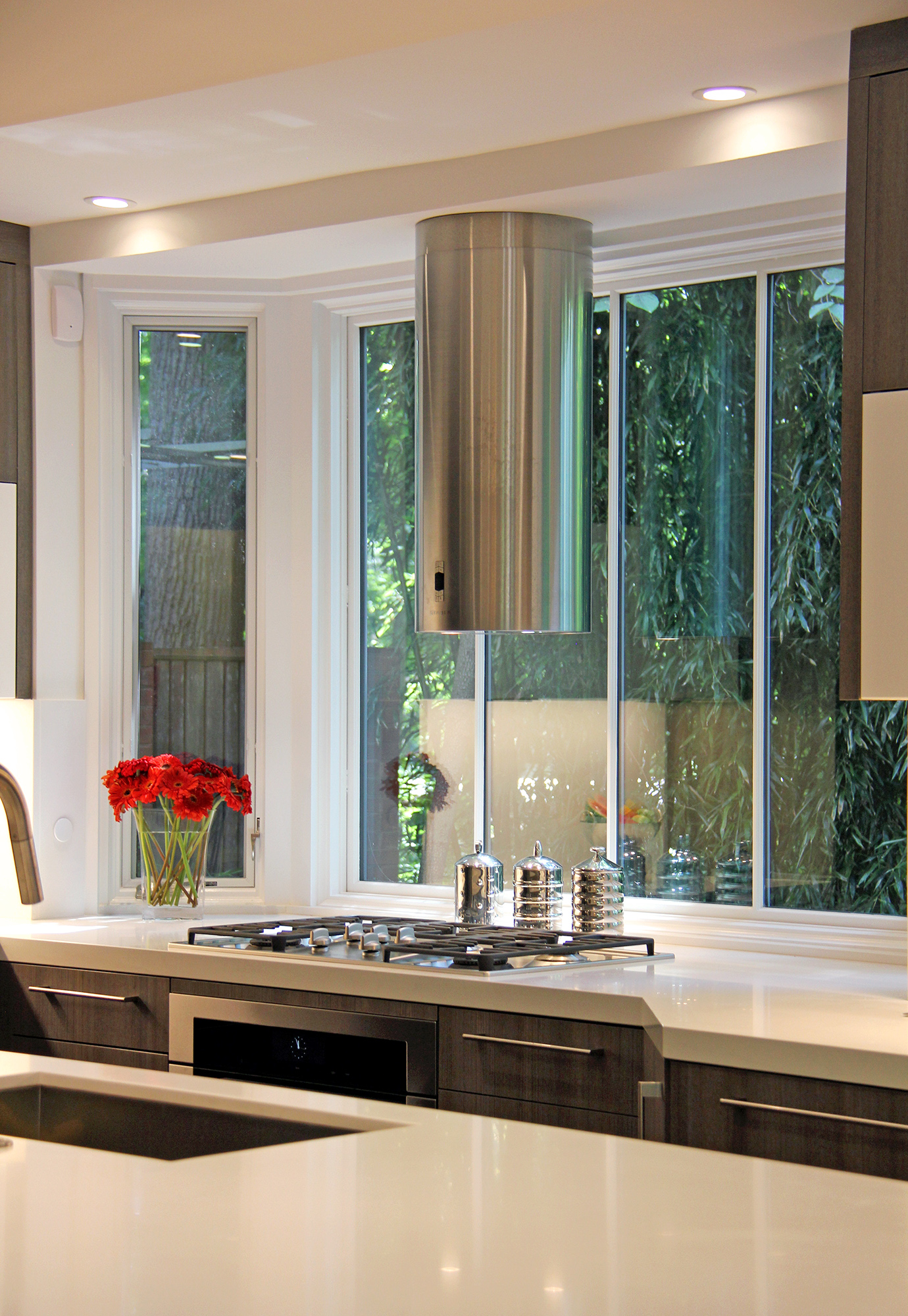
You’ll be living with your renovation for years, so add elements to keep it interesting to you and your guests. The Wards chose a cylindrical, floating stainless-steel range hood that serves as a focal point and adds interesting curves to the horizontal design. Other places to put your personal stamp: an unusual faucet fixture, a striking pendant lamp, or a color-accent island top.
When it comes to storage, think bigger
Nothing cuts the kitchen chaos faster than storage that makes sense. Map out what you need, then consider adding a little more. The Wards designed a breakfast station with an appliance garage: customized pivoting doors that turn to reveal a toaster and coffee supplies. The result is streamlined, serene, and ready for the morning.
It’s always more than just the kitchen
Your goal is a kitchen renovation, but that will inevitably affect more rooms in the house. The best renovation gives you more possibilities and solutions. Think about adding a pantry, a bar, a mudroom, or an office/homework space adjacent to the kitchen.
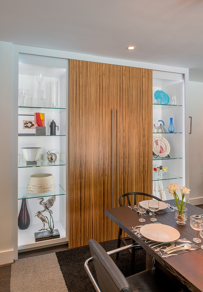
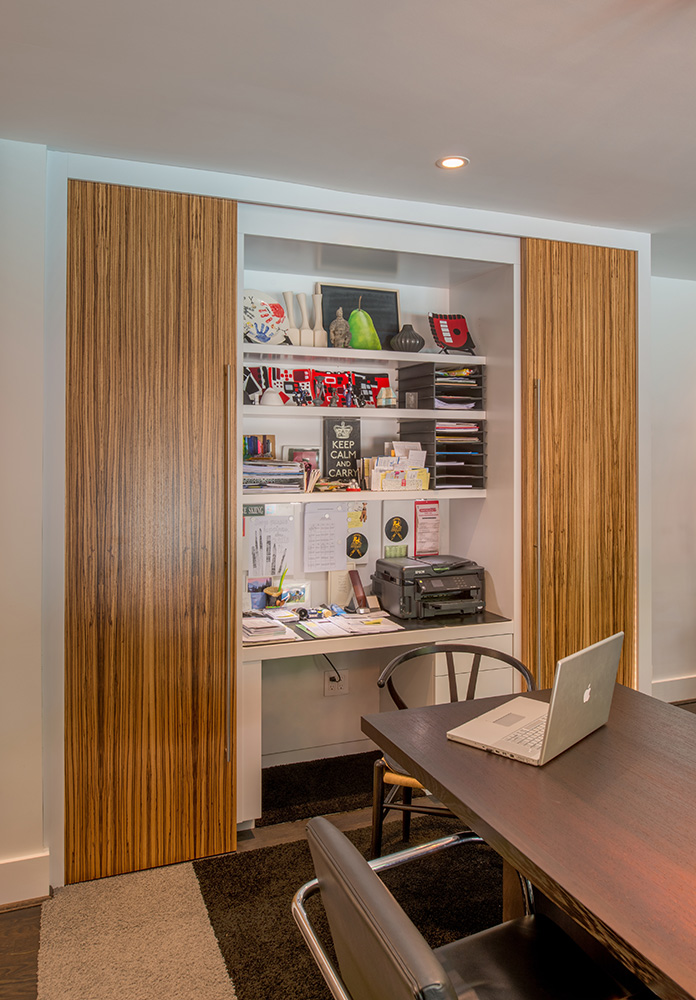
The Wards came up with an ingenious solution to get desk space: building an office niche into the wall next to the kitchen. When it’s time to entertain in the open dining room, the zebrawood doors slide closed to conceal the desk and storage, and reveal unique and elegant built-in glass shelving that showcases their art.
The result was a kitchen that not only meets the family’s needs as they continue to change and grow, but one that was named a “Kitchen to Die For” in Washingtonian magazine.


